It’s no secret that I love good architecture. Everybody knows that. Most people also know that I love the architecture of the end of the 19th century and first decade of the twentieth, and especially American architecture. I’m not a huge fan of the 1920s and 30s, though I will admit that there is some stuff from that period that I actually like… just not as much as the late 19th century.

The cul-de-sac from the street.

At the very bottom you see these two very modern houses. Dorothy, we're not in Kansas anymore!
Today the Jeanneret house is the home to the offices of the Fondation Le Corbusier while the La Roche house is open to the public. Luckily, however, because of its location and because Le Corbusier is largely unknown by the masses, the Maison La Roche is a fairly quiet museum unless, as I found when I arrived, there is a group of middle school children running rampant. Luckily for me, they left soon after I started my visit.

Entry hall
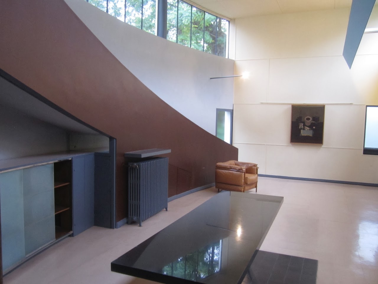
The art gallery, which I just found to be an amazing room, is at the top of the stairs and is sort of strangely shaped, with one curved wall and one flat wall, which has almost no windows. (Obviously windows would get in the way of hanging space for art.) It has a small fireplace and a ramp that goes to the library on the next level up. According to the guide, the ramp was used by Le Corbusier because he felt that it allowed the two different floors to feel as though they were one floor; stairs very clearly break up the layers of a house, while the ramp sort of bridges the gap between the floors. What really shocked me about the gallery was how colorful it was. In my head the work of Le Corbusier was monochromatic: white. Oh no. In the gallery alone I counted at least seven different colors being used. Some of them were various shades of the same color, but they were different. The floor was a sort of pink color (a rubber chosen by Le Corbuser when he did renovations to the house in 1928), the ramp was a chocolatey brown, certain features were a battleship grey, blue was used on the light fixture (also a 1928 addition by Corb), the table was black and had black tiles beneath it, and the walls weren’t all the same color. Luckily, paint analysis in the last few years has allowed the foundation to repaint the rooms in the same colors that Corb chose originally, and it provides a very interesting insight in the style. The gallery also has three of the very few pieces of art in the entire house. They are all large paintings by Le Corbusier, himself and, while not my personal favorite of styles, they work perfectly in the space. Likewise, I’m not the biggest Picasso or Braque fan, but Mr. La Roche was, and I totally understand how these artists and their work fit into the space.


I dont understand why they placed the settee in front of the door because the original photos don't show it that way, and it totally blocks the door. The little thing to the right is the fireplace with the slide-down doors typical of French fireplaces. The rounded column like thing is the chimney. Sleek, huh?


Corb-designed chair in the library

View across the atrium from the library. Notice how the ceiling heights block out the heads of the people on the other side of the atrium, headed to the bedroom. Sort of unnerving, isn't it? But cool, too.
Sliding back down the ramp (literally) and walking through the gallery, I took the bridge across the open atrium to the dining room. In actuality it’s not so much a bridge as it is a catwalk because it is against one of the exterior walls of the building. BUT… what makes it feel like a bridge is the fact that the exterior wall is almost entirely glass! It’s interesting because this huge wall of glass lights the entire entryway/atrium, but when you walk into the house all you see are solid walls.

The bridge looking toward the art gallery which is to the left and the library which is at the top. Notice how the interior color isn't quite white, it's a pale beige. This was also the original color of the exterior of the house.

Another view of the bridge and the art gallery, with its high windows.


Corb-designed wall light

La Roche table in the Purist bedroom

Corb-designed door handle

Staircase headed up to the bedroom
One detail that I really loved throughout the house were the windows, which I could tell were swinging windows from the hardware. What I didn’t realize, however, was that they pivoted on their center rather than swung open from one side. I think it’s such a cool idea. Of course, it would never work in the US because we have lots of flying bugs but, for whatever reason, France doesn’t really have that issue, so window screens are not a priority. Corb also took the time to consider the impact of rain coming in through the giant pivoting windows and made the windowsills concave to collect the water before it dripped down the walls. But… better than that… he included weep holes so whatever water was collected inside would end up back outside. How clever is that?! It’s so much like a boat and it makes such good sense. Of course, Corb was also fascinated with ocean liners because of their beauty, grace, and efficiency, so it’s not a huge shocker to see nautical details, but the fact that he considered the negative impact of water sitting on a painted concrete surface really shows what a comprehensive architect he was.


View down into the atrium from just outside the bedroom. Luckily there is a stainless steel net to keep you from falling out of the hallway, which wasn't a Corb-approved change.
Above this bedroom is the rooftop terrace, a signature feature for Le Corbusier, who felt that people living in his houses should go to the rooftop terrace and do exercises. Unfortunately the rooftop terrace was closed to visitors, but I did get a chance to look it over and my consensus is that it would be much better suited to cocktails than exercising. The only issue would be coming back downstairs because the staircase is a bit steep and narrow.

Back on the ground floor, there was only one space that I had not yet visited: the service area. Like many houses in Paris of the time, the Maison La Roche was equipped with large room where his butler and maid/cook could live, which happened to be attached to the kitchen. Unfortunately no photos of this sleeping/living room for the staff have been found to show it as it was originally furnished, but it is a very strangely shaped room and I spent a fair amount of time trying to envision how two people lived and worked out of that space. Better yet, the original paint scheme shows that it was orange and green - not exactly dim colors - and I really wonder how those colors played into Corb’s idea of how the space should be laid out and used, because I’m sure he chose the colors for a reason. From there I went into the kitchen which was miniscule. Just tiny. And everything seemed very inconvenient. The counter was at a very strange height - just barely too low - and was oddly deep. The cupboards were huge and went all the way to the ceiling and were varnished plywood, which stood in stark contrast to the rest of the room, which was very white and sanitary. In total, the kitchen seemed to me to be almost non-Corbusian because it was so awkward and non-efficient seeming.

The frosted glass panel at the left is the back side of the dumbwaiter from the kitchen to the butler's pantry above.

The grayish color is the original paint color.

The art gallery from outside

The La Roche house starts at the left hand garage door and goes to the left, while everything from the right is the Jeanneret house.

Jeanneret house
Having spent an entire afternoon thinking about 1920s architecture, I was really beginning to question who I was as a student of architectural history. And more importantly: did I just like a piece of modern architecture? Whoa… That’s deep, man.
No comments:
Post a Comment